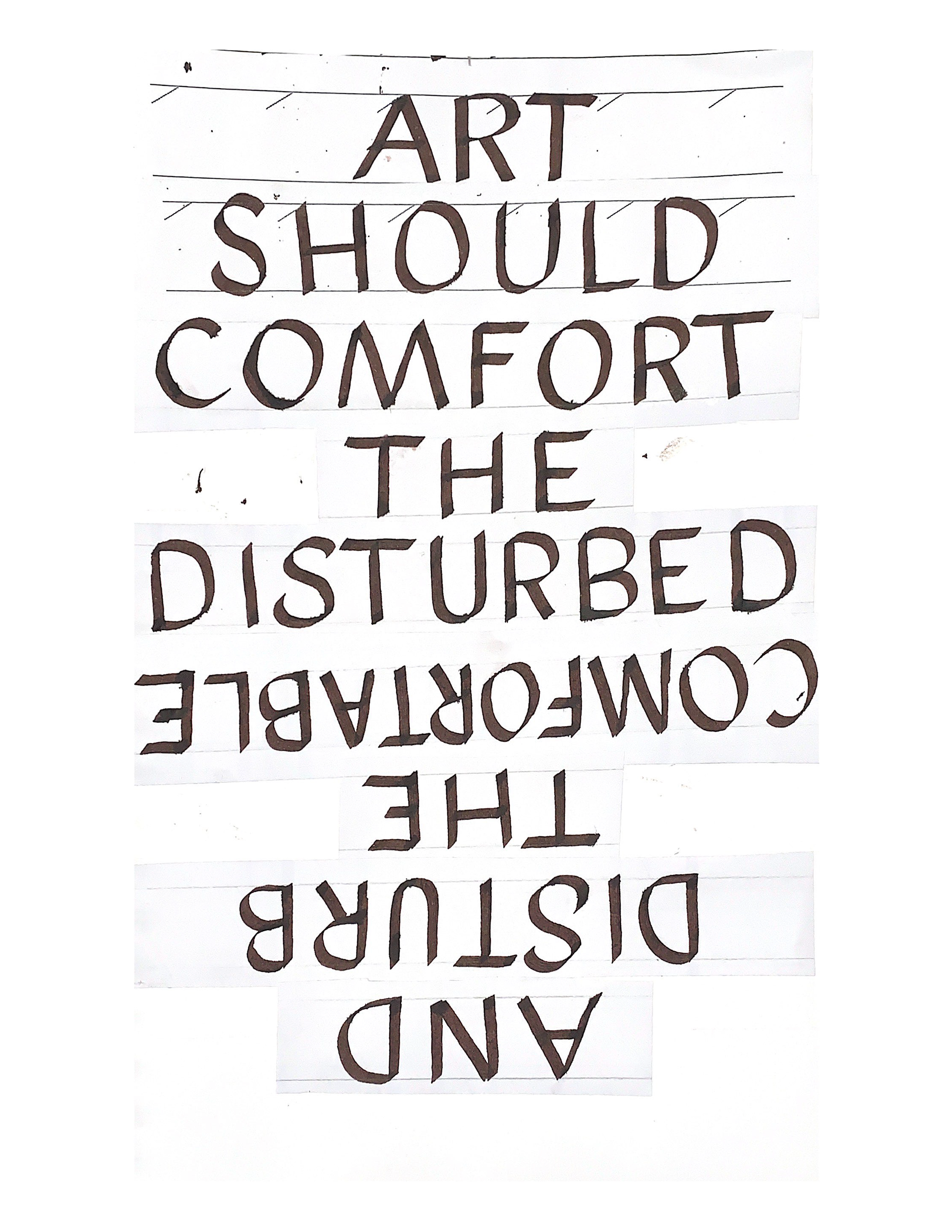
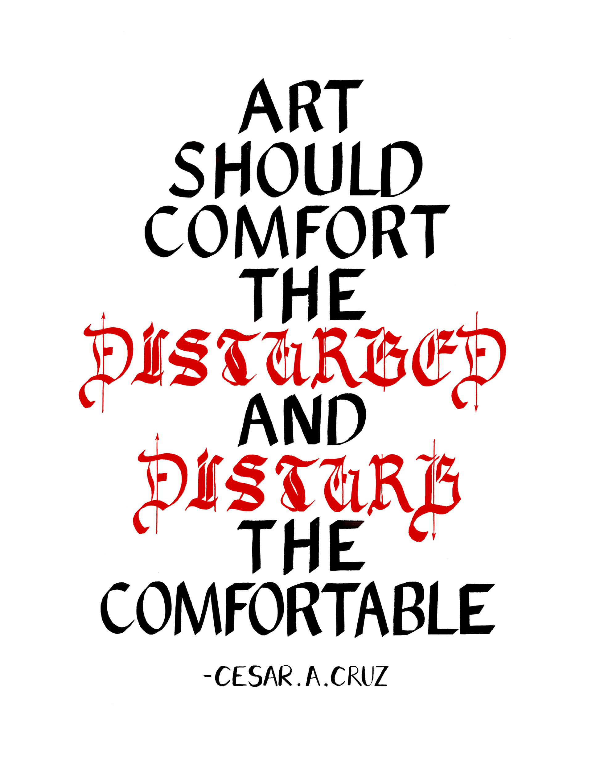
This custom typography is a visually compelling and meaningful piece that harmoniously balances symmetry with intentional disturbances, achieved through a blend of analog and digital techniques.

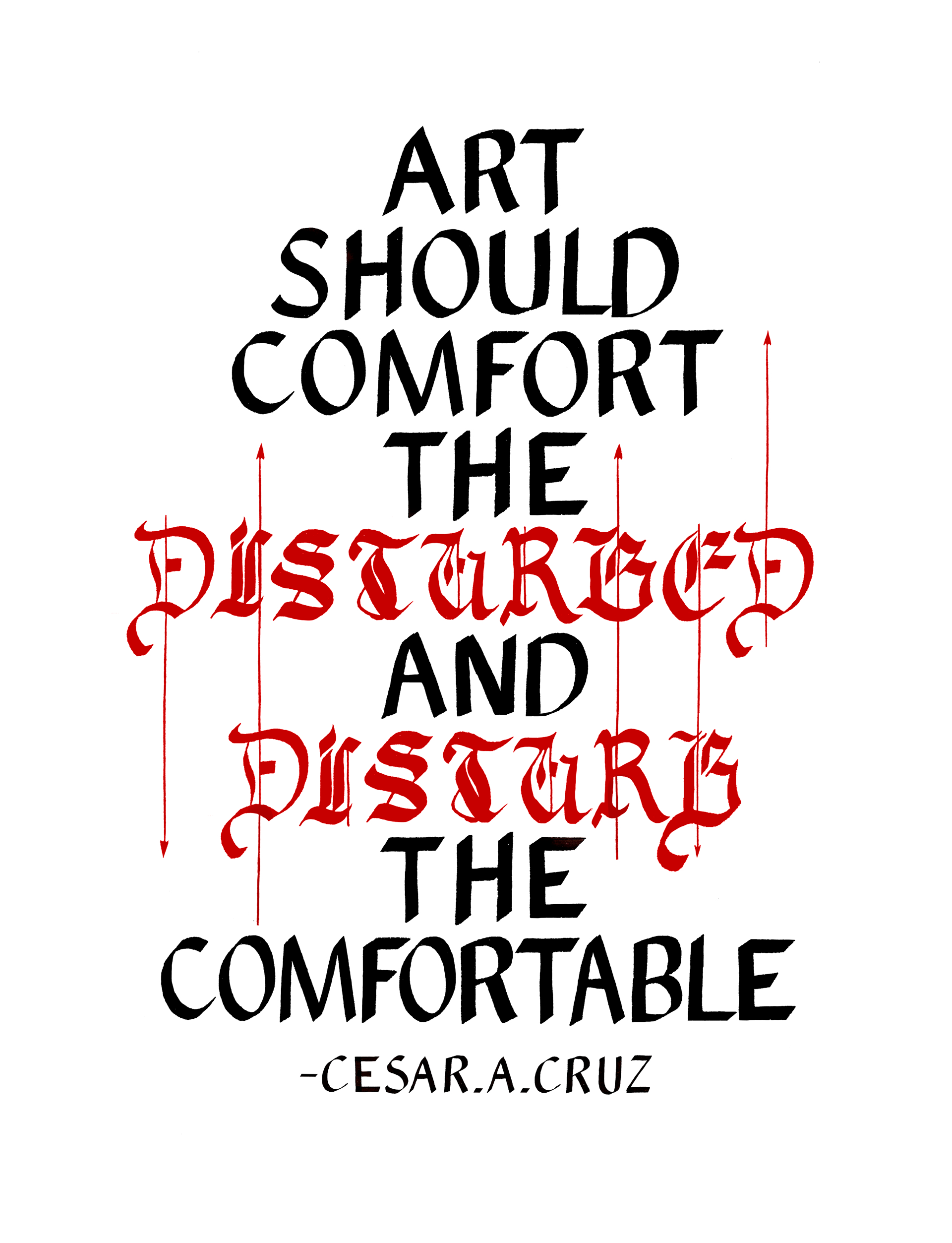
This project delves into custom typography. During the initial phase, I experimented with line breaks to establish symmetry and developed rough sketches focusing on hierarchy and scale. To incorporate the theme of disturbance, I utilised photocopied versions and collage techniques to disrupt the layout. For precision, I refined the design in Photoshop, adjusting Roman Caps letters and incorporating a Black Letter element for added visual interest. Final adjustments involved enhancing embellishments, introducing swashy 'D' and 'B' letters with arrows to underscore the concept of disturbance, and finalizing a complementary, unobtrusive attribution.